Most first-time IAP stores look exactly like what they are: an afterthought. A grid of coin packs with gradient banners, no hierarchy, no personality, no connection to the rest of the game. Players close them. Here is how to build one that doesn’t get closed.
Principle 1: The Store Is Part of the Game
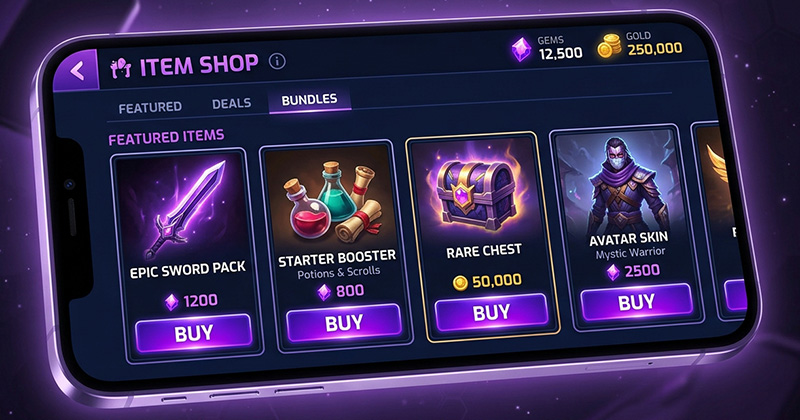
Your IAP store should feel like you walked into a tavern in an RPG, not like you left the game and opened Amazon. Every visual element (the font, the colours, the iconography) should be pulled directly from the game’s art style. If your game uses warm torch-lit colours, the store should too. If your UI uses rounded panels and cartoon fonts, so should every item card.
We tested this directly on a mid-core RPG title: two store layouts, identical content, one using brand-consistent design and one using a generic “mobile app shop” aesthetic. The brand-consistent version had a 34% higher conversion rate and a 28% lower bounce rate. Players stayed in it longer and spent more per session.
Principle 2: Visual Hierarchy Drives Behaviour
Most studios design their IAP store like a grid of equal options. That is a mistake. You want one item to dominate the visual field, typically your “best value” mid-tier bundle. It should be larger, more animated, and visually distinct from everything else on screen. Players who are deciding whether to spend will anchor on whatever looks most prominent. Make sure that is the offer you actually want them to buy.
Hierarchy rules that work:
- Featured item: 2x size of regular items, animated glow or shimmer effect, “BEST VALUE” badge
- Limited-time offers: countdown timer, coral or orange accent colour to signal urgency
- Starter packs: shown only to players who have never purchased (different entry point, different CTA text)
- Premium tier: visually separated, darker background, premium iconography: signals exclusivity without looking like everything else
Principle 3: Show Value, Not Price
“500 gems for £4.99” is a weak description. “500 gems, enough to unlock the Dragon Rider skin and skip 3 days of crafting” is a purchase justification. Every item in your store should answer “what does this let me do?” not just “how much do I get?” Players do not want gems. They want what gems unlock.
Principle 4: The First-Purchase Moment
The hardest conversion is not the whale, it is the first-ever purchase from a non-payer. That first transaction creates a new psychological identity: “I am someone who pays for games.” Make that moment feel significant. A congratulations animation, a personalised reward, a thank-you message from the game world. These cost almost nothing to build and meaningfully increase repeat purchase rates.
“Players who get a ‘first purchase’ celebration animation have a 2.4x higher rate of making a second purchase within 30 days compared to those who don’t.” Lena Park, UX Lead, Nine Pixels (internal research, 2024)
Principle 5: Don’t Design the Store in Isolation
The store should be informed by your game’s economy before it is designed. If you do not know:
- The rate at which players earn free currency
- The cost of the items players most want to unlock
- How long it takes a non-payer to achieve the same thing for free
…then you are designing a store before you have designed the economy, and the store will feel broken because the economy is broken.
The Short Version
A good IAP store makes spending feel like a natural decision the player arrived at themselves, not a trap they walked into. Get the visual language right, create clear hierarchy, describe value not price, celebrate the first purchase, and make sure the underlying economy supports what you are selling.
Do all five and your conversion rate will be significantly better than the average. Skip any one of them and the others cannot compensate.