Crystal Raiders: Mobile Shooter UI/UX Redesign
UI/UX Design · Figma · Unity UI Toolkit · Quest Map · Shop · Daily Tasks
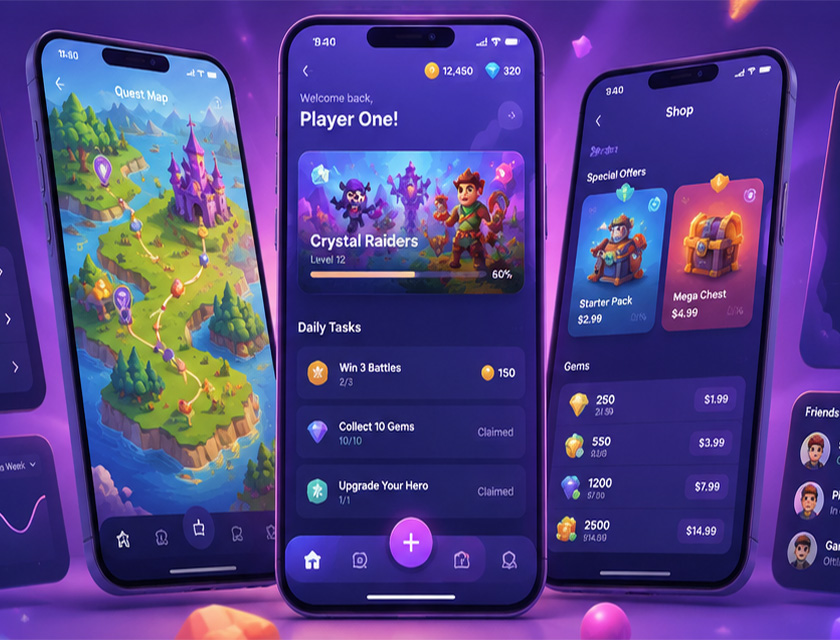
Crystal Raiders is a mid-core mobile RPG with a quest map, player hub, daily task system, and in-app shop. The studio came to Nine Pixels with a live game that was bleeding players: 40% dropped out within the first 3 minutes of onboarding and the shop conversion rate was a fraction of what the studio's own cohort data showed was achievable. Nine Pixels redesigned four core screen flows from the ground up, built a unified design system, and shipped the new UI within 6 months, delivering a +42% session length increase and +28% DAU growth within 8 weeks of relaunch.
The game had four distinct problem areas. The quest map used a flat list of level nodes with no visual hierarchy, making it hard for returning players to find where they were. The player hub was cluttered: daily tasks, active quests, and social prompts were stacked with equal visual weight and no clear call to action. The shop had accumulated nine separate purchase categories over two years with no offer hierarchy, burying the best-value deals below the fold. Onboarding was a 12-screen tutorial gate before players could interact with anything. The studio had patched each area independently, which meant three different button styles, four icon sizes, and no consistent spacing. Any further feature work risked making it worse.
Weeks 1–3: Audit. Session recordings, heatmaps, and 12 player interviews. We identified the shop fold problem, the quest map orientation issue, and the onboarding drop-off point within the first session. Weeks 4–7: Design system. One 8pt spacing grid, five text styles (Display, Heading, Body, Label, Caption), three button hierarchies, and a purple-led colour token set applied across all screens. All components built as Figma variables so the studio could theme future content without breaking layout. Weeks 8–14: Quest map and hub. The map moved to an isometric world view with a visible player position marker and animated path to the next unlocked level. The hub was restructured around a single primary action card (active quest progress) with daily tasks in a scrollable tray below. Weeks 15–20: Shop redesign. Two featured offer slots above the fold, a gem tier ladder with clear value anchoring, and a persistent currency display in the nav bar so players always knew their balance. Weeks 21–24: Onboarding cut from 12 screens to a 90-second in-game tutorial. A/B test, final iteration, handoff with full Figma token library and implementation notes.
Our shop was generating a fraction of what it should for the player base we had. Nine Pixels didn't just make it look better. They restructured the whole offer hierarchy and the results came through in the first week post-launch.